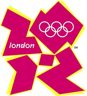
 I love the new 2012 Olympic logo; it's so clever.
If you turn your head 90 degrees, you can almost see a graphic designer (stuck in the 80's new romantics phase), laughing in the face of Lord Coe.
Genius.
So glad my taxes are being spent on World class creative agencies.
Wolff Olins, shame on you.
2 comments:
http://theospark.blogspot.com/2007/06/london-olympics-logo.html
it's rubbish. what are they thinking?
Post a Comment